
 By
·
1 minute read
By
·
1 minute read
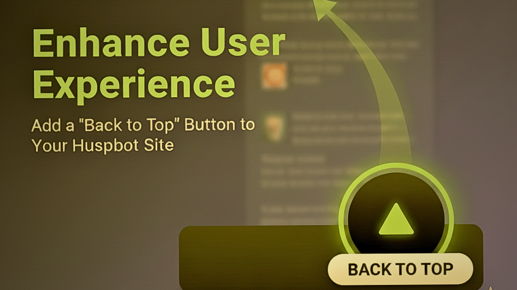
Stop the Scroll Fatigue: Enhance UX with a Simple Button
If your website features long-form content—detailed service pages, comprehensive blog posts, or lengthy landing pages—you know how much scrolling is involved. While long content is great for SEO, it can lead to scroll fatigue for your visitors.
The solution? A simple, fixed "Back to Top" button.
By injecting a small, self-contained HTML/CSS/JavaScript snippet into your HubSpot site's global footer, you can instantly add a floating, functional button that appears when visitors scroll down and, with one click, smoothly sends them back to the page header. The Interactive theme or any HubSpot theme works perfectly across all pages, blog posts, and landing pages.
Here’s the complete guide, using your preferred black and bright green aesthetic.
The Complete "Back to Top" Code Snippet
This single block of code contains everything: the button element, the custom styling (CSS), and the smooth-scrolling functionality (JavaScript).
Copy the entire block below and paste it directly into your HubSpot settings.
<!-- START: Back to Top Button Implementation -->
<style>
/* 1. Base Styling and Positioning */
#backToTopBtn {
display: none; /* Hidden until user scrolls down */
position: fixed; /* Keep it visible while scrolling */
bottom: 20px;
right: 30px;
z-index: 99; /* Ensure it floats above other content */
border: none;
outline: none;
/* 2. Custom Colors and Shape */
background-color: black;
color: #6cca0b; /* Bright Green Carrot/Arrow Color */
border-radius: 50%; /* Perfect Circle */
/* 3. Sizing and Appearance */
cursor: pointer;
padding: 15px;
font-size: 30px; /* Arrow/Carrot Size */
line-height: 0;
box-shadow: 0 4px 8px rgba(0, 0, 0, 0.4); /* Subtle Shadow */
transition: background-color 0.3s, transform 0.2s;
width: 50px;
height: 50px;
}
#backToTopBtn:hover {
background-color: #333333; /* Dark gray for hover feedback */
transform: scale(1.05);
}
</style>
<!-- The Button HTML Element (Up-pointing triangle/Carrot) -->
<button onclick="scrollToTop()" id="backToTopBtn" aria-label="Go to top">
▲
</button>
<script>
const backToTopBtn = document.getElementById("backToTopBtn");
// Smooth scroll function
function scrollToTop() {
window.scrollTo({
top: 0,
behavior: "smooth"
});
}
// Function to show/hide the button based on scroll position (300px trigger)
window.onscroll = function() {scrollFunction()};
function scrollFunction() {
// Use document.documentElement.scrollTop for modern browsers
if (document.body.scrollTop > 300 || document.documentElement.scrollTop > 300) {
backToTopBtn.style.display = "block";
} else {
backToTopBtn.style.display = "none";
}
}
// Expose the scroll function globally
window.scrollToTop = scrollToTop;
</script>
<!-- END: Back to Top Button Implementation -->
Step-by-Step HubSpot Implementation
You only need to complete these steps once to deploy the button site-wide.
Access Settings: Log into your HubSpot portal and click the Settings icon (the gear) in the main navigation bar.
Navigate to Pages: In the left sidebar navigation, expand the "Website" section and click on Pages. Open the Templates Tab: At the top of the content area, switch to the Templates tab.
Locate Footer HTML: Scroll down until you find the section labeled Site Footer HTML.
Paste and Save: Paste the entire code block from Section 1 into the text area for the Site Footer HTML.
Publish Changes: Scroll to the bottom and click the Save button.
The code is now live! It loads just before the closing </body> tag on every page, ensuring maximum compatibility and seamless operation.
Future Customization Guide
If you decide to change your site's color scheme or want a different icon in the future, here is exactly where you can edit the three main elements:
1. Change the Button Color (Background)
Location: Look for the CSS selector #backToTopBtn within the <style> tags.
Property to Edit: background-color: black;
Tip: Change black to your desired background hex code (e.g., #FF5733).
2. Change the Arrow/Carrot Color
Location: Look for the CSS selector #backToTopBtn within the <style> tags.
Property to Edit: color: #6cca0b;
Tip: Change #6cca0b to the new hex code for the arrow color (e.g., #FFFFFF for white).
3. Change the Arrow Character or Size
To change the size: Look for font-size: 30px; within the #backToTopBtn CSS. Increase or decrease the pixel value to make the icon larger or smaller.
To change the symbol: Look at the <button> HTML element:
<button onclick="scrollToTop()" id="backToTopBtn" aria-label="Go to top">
▲ <!-- EDIT THIS HTML ENTITY -->
</button>
You can replace ▲ (the current black triangle carrot) with other common HTML arrow entities:
⇧ (Thick double arrow)
↑ or ↑ (Simple up arrow)
A simple carat: ^
This small change is a powerful way to enhance your website's navigation and keep users focused on your content rather than searching for the scroll bar. Happy publishing!